Selecting the right colors for your home’s interior painting project plays a major role in setting the mood, enhancing décor, and creating a space that feels inviting. With endless shades available, narrowing down the perfect colors requires a thoughtful approach. From assessing natural light to considering color psychology, various factors influence the final decision. Homeowners often search for interior house painters near me to bring their vision to life, but a well-planned color selection ensures that every room reflects the desired style and atmosphere.
Assessing Natural Light to Inform Color Choices
Natural light has a significant impact on how paint colors appear in a room. The amount and direction of light can alter the way shades look throughout the day. North-facing rooms receive cool, indirect light, often making colors appear slightly muted. Warmer tones, such as soft yellows or light beiges, help balance the coolness in these spaces.
South-facing rooms benefit from abundant natural light, which enhances both warm and cool colors. These spaces allow for bolder color choices since the brightness prevents darker shades from feeling overwhelming. East-facing rooms receive morning sunlight, which is bright but fades throughout the day. Softer hues work well in these spaces to maintain a welcoming feel. In contrast, west-facing rooms get warmer light in the evening, making deeper shades stand out more vibrantly during sunset.
Artificial lighting also affects how paint appears. Warm white bulbs enhance earthy tones, while cool white lighting intensifies blues and greens. Testing colors in different lighting conditions helps in making a more informed decision.
Psychological Effects of Different Paint Colors
The colors used in a home influence emotions and overall well-being. Each shade has psychological effects that can impact mood and energy levels. Soft blues and greens promote relaxation, making them ideal for bedrooms and living spaces. These hues create a calming atmosphere, reducing stress and enhancing comfort.
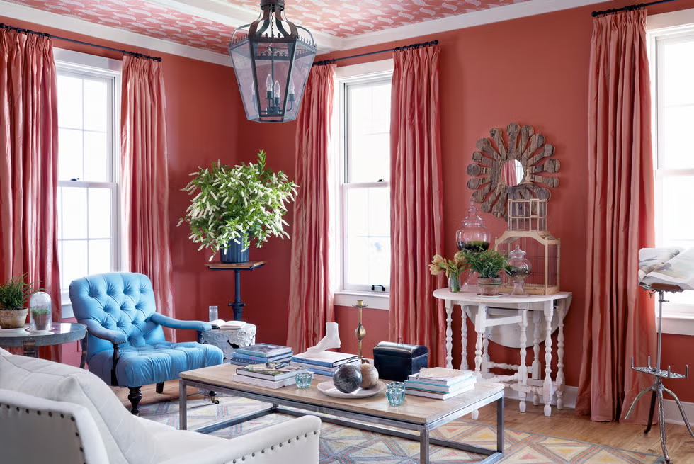
Warmer tones, such as reds and oranges, bring energy and warmth. While these shades are bold, they work well in dining areas or kitchens, where they encourage conversation and appetite. Neutral colors, including whites, grays, and beiges, offer versatility and a timeless appeal. They serve as a foundation for various décor styles and create a sense of openness.
Darker colors, such as deep navy or charcoal, add sophistication and depth but should be used thoughtfully to prevent a space from feeling too enclosed. Accent walls in rich tones create a striking visual contrast without overpowering the room. Understanding the emotional impact of colors helps in choosing shades that complement the function of each space.
Harmonizing Paint Colors with Existing Décor
A home’s existing décor plays a key role in determining suitable paint colors. Walls should complement furniture, flooring, and decorative elements rather than clash with them. A cohesive color scheme ties everything together, creating a balanced and visually appealing space.
For homes with modern décor, crisp whites, cool grays, and muted blues enhance sleek designs and minimalist aesthetics. Traditional interiors benefit from warm neutrals, soft creams, and deep earth tones that add elegance and warmth. Rustic styles work well with rich browns, terracotta, and muted greens, reflecting a natural and cozy ambiance.
Contrasting colors add visual interest, but maintaining harmony is essential. If furniture and décor feature bold patterns or vibrant hues, neutral wall colors provide a balanced backdrop. Conversely, if furnishings are understated, bolder wall colors can bring character and depth to the space. The goal is to achieve a seamless flow between walls, furniture, and accents for a well-integrated look.
Current Interior Paint Color Trends
Trends in interior paint colors evolve over time, influenced by design preferences and lifestyle changes. While some classic shades remain popular, new color trends bring fresh inspiration to modern interiors. Soft, earthy tones have gained popularity, reflecting a shift toward natural and organic aesthetics. Warm taupes, sandy beiges, and olive greens create a grounded and inviting feel.
Muted pastels, such as dusty pinks and soft lavenders, bring a subtle yet sophisticated touch to spaces, especially in bedrooms and living areas. Deep, moody shades, including charcoal gray, forest green, and rich burgundy, add drama and depth, making them ideal for statement walls or accent areas.
Timeless whites and off-whites remain a top choice for their ability to brighten spaces and create a clean, airy feel. However, modern variations of white now include warm undertones that add softness without feeling stark. Choosing trending colors should align with personal style to ensure a lasting appeal beyond seasonal trends.
Utilizing Color Theory in Interior Design
Color theory provides a structured approach to selecting harmonious combinations for interior spaces. The color wheel serves as a guide for pairing shades that complement or contrast effectively. Monochromatic schemes use different shades of the same color, creating a cohesive and elegant look. Light and dark variations of a single hue provide depth without overwhelming the space.
Complementary color schemes involve pairing colors from opposite sides of the color wheel, such as blue and orange or green and red. These combinations add vibrancy and contrast, making them ideal for accent walls or decorative elements. Analogous color schemes use neighboring colors on the wheel, such as blue, teal, and green, for a smooth, harmonious transition between shades.
The 60-30-10 rule is a useful guideline for achieving balance in a room. Sixty percent of the space is dedicated to a dominant color, usually the walls. Thirty percent consists of a secondary color, applied to furniture or textiles. The remaining ten percent features an accent color through accessories or small details. Applying color theory ensures that selected shades work together to enhance the overall ambiance.
Testing Paint Samples Before Finalizing Choices
Before committing to a specific color, testing paint samples on the walls is essential. Small swatches may not always reflect how a color will look in a full room, especially under different lighting conditions. Applying test patches on multiple walls allows for a more accurate assessment of how the shade interacts with natural and artificial light.
Paint samples should be observed at different times of the day to see how lighting influences the color’s appearance. Morning light, midday brightness, and evening shadows all play a role in how a color looks. Painting samples near existing furniture or cabinetry helps ensure compatibility with the room’s elements.
Different finishes also affect how a color is perceived. Matte finishes offer a soft, modern look, while satin and semi-gloss reflect more light, making colors appear slightly brighter. Testing different sheens helps in selecting the best option for durability and visual appeal. Taking the time to sample colors prevents costly mistakes and ensures satisfaction with the final result.
Conclusion
Choosing the right colors for an interior painting project involves evaluating natural light, considering psychological effects, and harmonizing shades with existing décor. Current trends and color theory provide useful guidance, while testing samples ensures confidence in the final choice. Whether aiming for a calming retreat or a vibrant space, thoughtful color selection enhances the home’s atmosphere. Homeowners searching for interior house painters near me can benefit from expert advice and professional application to achieve a flawless finish.