In the ever-evolving landscape of web design, the debate between responsive and adaptive web design continues to be a topic of discussion. Both approaches have their merits and drawbacks, and understanding the differences between them is crucial for making an informed decision when designing your website. In this comprehensive guide, we will delve into the intricacies of responsive and adaptive web design, explore their respective benefits and limitations, and help you determine which approach is best suited for your needs.
Understanding Responsive Web Design
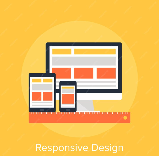
Responsive web design (RWD) is an approach to web design that ensures a website’s layout adapts to the screen size of the device on which it is viewed. This is achieved through the use of flexible grids and layouts, CSS media queries, and responsive images. When a user accesses a responsive website, the design elements rearrange themselves to fit the screen, providing an optimal viewing experience.
Key Features of Responsive Web Design:
- Fluid Grids: Instead of fixed-width layouts, responsive designs use fluid grids that adjust proportionally to the screen size, ensuring that content remains readable and accessible.
- Media Queries: CSS media queries are used to apply different styles based on the device’s screen size, allowing for a seamless transition between desktop, tablet, and mobile layouts.
- Flexible Images: Responsive images are sized in relative units (such as percentages) to ensure they adapt to different screen sizes without losing quality or breaking the layout.
- Viewport Meta Tag: The viewport meta tag is used to control the viewport’s size and scale on different devices, ensuring that the website is displayed correctly.
Benefits of Responsive Web Design:
- Improved User Experience: Responsive design provides a consistent and optimized user experience across all devices, leading to higher engagement and lower bounce rates.
- Cost-Effectiveness: While initial development costs may be higher than non-responsive designs, the long-term maintenance costs are lower as the website adapts to new devices and screen sizes.
- SEO-Friendly: Google recommends responsive design as it makes it easier for their bots to crawl and index content, leading to better search engine rankings.
- Future-Proofing: With the proliferation of new devices with varying screen sizes, responsive design ensures that your website is ready for the future.
Understanding Adaptive Web Design
Adaptive web design (AWD) is an approach that involves creating multiple versions of a website, each designed for a specific screen size or device. When a user accesses an adaptive website, the server detects the device and loads the appropriate version of the site. This approach allows for more control over the design and layout for each specific device, providing a customized user experience.
Key Features of Adaptive Web Design:
- Multiple Layouts: Adaptive designs consist of multiple layouts, each optimized for a specific screen size or device, such as desktops, tablets, and smartphones.
- Device Detection: Adaptive designs use server-side or client-side device detection to determine the device’s screen size and load the appropriate layout.
- Customized Content: Each layout can be tailored to the specific device, ensuring that users get the best possible experience on their device.
- Progressive Enhancement: Adaptive designs can use progressive enhancement to add additional features and functionality for devices with larger screens and more capabilities.
Benefits of Adaptive Web Design:
- Customized User Experience: Adaptive design allows you to tailor the user experience to specific devices, potentially leading to higher conversions and engagement.
- Faster Load Times: Since adaptive designs only load the necessary elements for a specific device, they can be faster than responsive designs, especially on slower connections.
- Better Support for Older Devices: Adaptive designs can be optimized for older devices that may not fully support responsive design techniques, ensuring a consistent experience across all devices.
- Design Flexibility: With adaptive design, you have more control over how your website looks on different devices, allowing for a more customized and tailored experience.
Choosing the Right Approach for Your Website
When deciding between responsive and adaptive web design, several factors should be considered:
- Budget: Responsive design may be more cost-effective in the long run, as it requires less maintenance and updates compared to adaptive design, which requires maintaining multiple versions of the site.
- User Base: Consider the devices your target audience is likely to use. If they primarily use smartphones or tablets, responsive design may be sufficient. However, if you have a significant number of users on older devices or specific screen sizes, adaptive design may be more appropriate.
- Content: The type of content on your website can also influence your decision. If your website has a lot of multimedia content, adaptive design may be more suitable as it allows for more customization for each device.
- Maintenance: Consider how much time and resources you have for maintaining your website. Responsive design requires less ongoing maintenance, while adaptive design may require more effort to keep multiple versions up to date.
- Future-Proofing: Responsive design is generally more future-proof, as it adapts to new devices and screen sizes automatically. However, adaptive design can also be future-proof if it is designed with scalability in mind.
In conclusion, both responsive and adaptive web design have their strengths and weaknesses, and the right approach for your website depends on your specific needs and constraints. If you need a flexible, cost-effective solution that works well on all devices, responsive design may be the way to go. However, if you require more control over the user experience and have the resources to maintain multiple versions of your site, adaptive design may be a better choice.
Regardless of the approach you choose, the goal remains the same: to provide an optimal user experience across all devices. By understanding the differences between responsive and adaptive design and considering your specific requirements, you can make an informed decision that will benefit your website and its users.
Websvent is the top choice for businesses seeking high-quality, affordable web design services. With a skilled team and years of experience, Websvent offers customized solutions, affordable pricing, and cutting-edge technology to ensure customer satisfaction. Trust Websvent to deliver a professional and engaging online presence for your business.