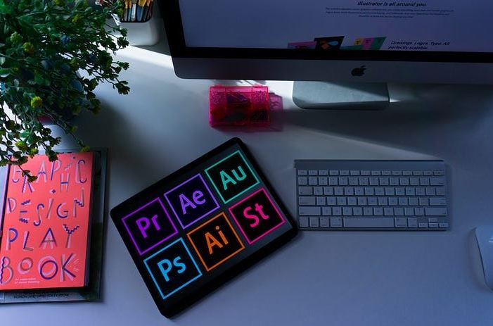
In today’s visually-driven world, the importance of effective graphic design in crafting strong visual communications cannot be overstated. Graphic design serves as a powerful tool that transcends mere aesthetics; it conveys messages, evokes emotions, and engages audiences in ways that words alone often cannot achieve. Whether it’s through compelling advertisements, informative infographics, or eye-catching social media posts, effective design can make the difference between capturing attention and being overlooked entirely. However, even seasoned graphic designers are not immune to common pitfalls that can undermine their efforts.
With the ever-evolving landscape of design trends and technologies, it is easy to fall victim to missteps that detract from the intended message or confuse the audience. This reality underscores the need for vigilance and continual learning within the field. The purpose of this post is to shed light on five frequent mistakes that designers may encounter throughout their creative process. By identifying these errors and providing practical tips for avoiding them, we aim to empower both novice and experienced designers alike to elevate their work. In doing so, we hope to enhance their ability to create impactful visuals that resonate with viewers and effectively communicate their intended messages.
Mistake #1: Overloading the Design with Elements
Mistake #2: Ignoring Hierarchy and Layout
Failing to establish a clear visual hierarchy can lead to a chaotic presentation of information, ultimately resulting in a frustrating experience for the audience. When there is no discernible structure, viewers may find themselves overwhelmed by the sheer volume of content, struggling to pinpoint what is truly important. Without guiding elements such as size, color contrast, and placement that signify priority, key messages risk being overlooked or misunderstood. This lack of organization not only hinders comprehension but also diminishes engagement; audiences are less likely to connect with material that feels disjointed or confusing. In essence, neglecting visual hierarchy undermines the effectiveness of communication and can leave audiences feeling lost amidst a sea of text and images. Therefore, implementing a well-defined visual hierarchy is essential for ensuring that information is presented in a manner that is both accessible and impactful.
Mistake #3: Poor Font Selection and Typography
Fonts that fail to align with a brand’s tone, are difficult to read, or create visual clashes can severely undermine the overall professionalism of a design. When selecting typography, it is crucial to understand that fonts are not merely aesthetic choices; they embody the brand’s identity and communicate its values. For instance, a playful and whimsical font might be appropriate for a children’s toy company but would appear unprofessional for a financial institution seeking to convey trust and stability. Furthermore, hard-to-read fonts can frustrate viewers, causing them to disengage from the content entirely. Imagine trying to navigate an important document where the text feels more like a puzzle than clear communication; such experiences can lead potential clients or customers to question the credibility of your brand. Additionally, when fonts clash—whether through mismatched styles or competing weights—it creates visual chaos that distracts from the intended message rather than enhancing it. In essence, careful consideration of font choice is essential not only for maintaining aesthetic appeal but also for ensuring effective communication and fostering trust in your brand image. Also, Read Elevating Language Skills: The Importance of PSLE English Tuition in Singapore
Mistake #4: Neglecting Color Harmony
Poor color choices can drastically undermine the effectiveness of a design, rendering it jarring or unprofessional in appearance. When colors clash or fail to harmonize, they create a visual cacophony that distracts viewers rather than engaging them. This disconnection can lead to a negative emotional response, causing potential customers or clients to turn away rather than appreciate the intended message of the design. For instance, imagine entering a room painted in clashing neon hues; instead of feeling welcomed and inspired, you might feel overwhelmed and uncomfortable. Similarly, in graphic design or branding, inappropriate color selections can detract from the credibility and aesthetic appeal of a brand, ultimately hindering its ability to connect with its audience effectively. Hence, choosing colors thoughtfully and strategically is not merely an artistic endeavor but a crucial aspect of effective communication that helps forge stronger connections between creators and their audiences.
Mistake #5: Using Low-Quality Images and Graphics
Low-resolution or poor-quality images can drastically undermine the aesthetic appeal and effectiveness of even the most well-crafted designs, rendering them unprofessional and uninviting. Imagine a beautifully designed marketing brochure or an eye-catching website; if these materials are accompanied by blurry, pixelated images, they fail to convey the intended message of quality and sophistication. Instead, they can provoke feelings of doubt in potential customers about the brand’s credibility and attention to detail. High-quality visuals are essential not just for aesthetic purposes but also for establishing trust with your audience. In today’s visually-driven world, where first impressions are often formed in mere seconds, investing in sharp, high-resolution imagery is crucial to ensuring your design communicates professionalism and captures the viewer’s interest effectively.
Conclusion
In summary, it is crucial to emphasize the importance of steering clear of these prevalent design mistakes in order to craft graphics that are not only professional but also engaging and effective. A well-designed graphic can capture attention, convey a message clearly, and leave a lasting impression on the audience. By avoiding pitfalls such as cluttered layouts, poor color choices, and inconsistent typography, designers can elevate their work to a higher standard. As you reflect on your own design projects, I encourage you to take the time to meticulously review and refine your designs. Remember that even small adjustments—like tweaking a font size or altering the color palette—can lead to significant improvements in the overall quality of the final product. These minor changes often make all the difference between an average graphic and one that truly stands out. Moreover, I invite you to share your own experiences regarding design challenges or common mistakes you’ve encountered along your creative journey. Engaging in discussions about these topics not only fosters learning but also builds a community where we can collectively improve our skills and avoid repeating errors. Your insights could be invaluable for others striving for excellence in their graphic design endeavors!